Client
CJK Design
role
Graphic Designer
STOKED BRAND IDENTITY
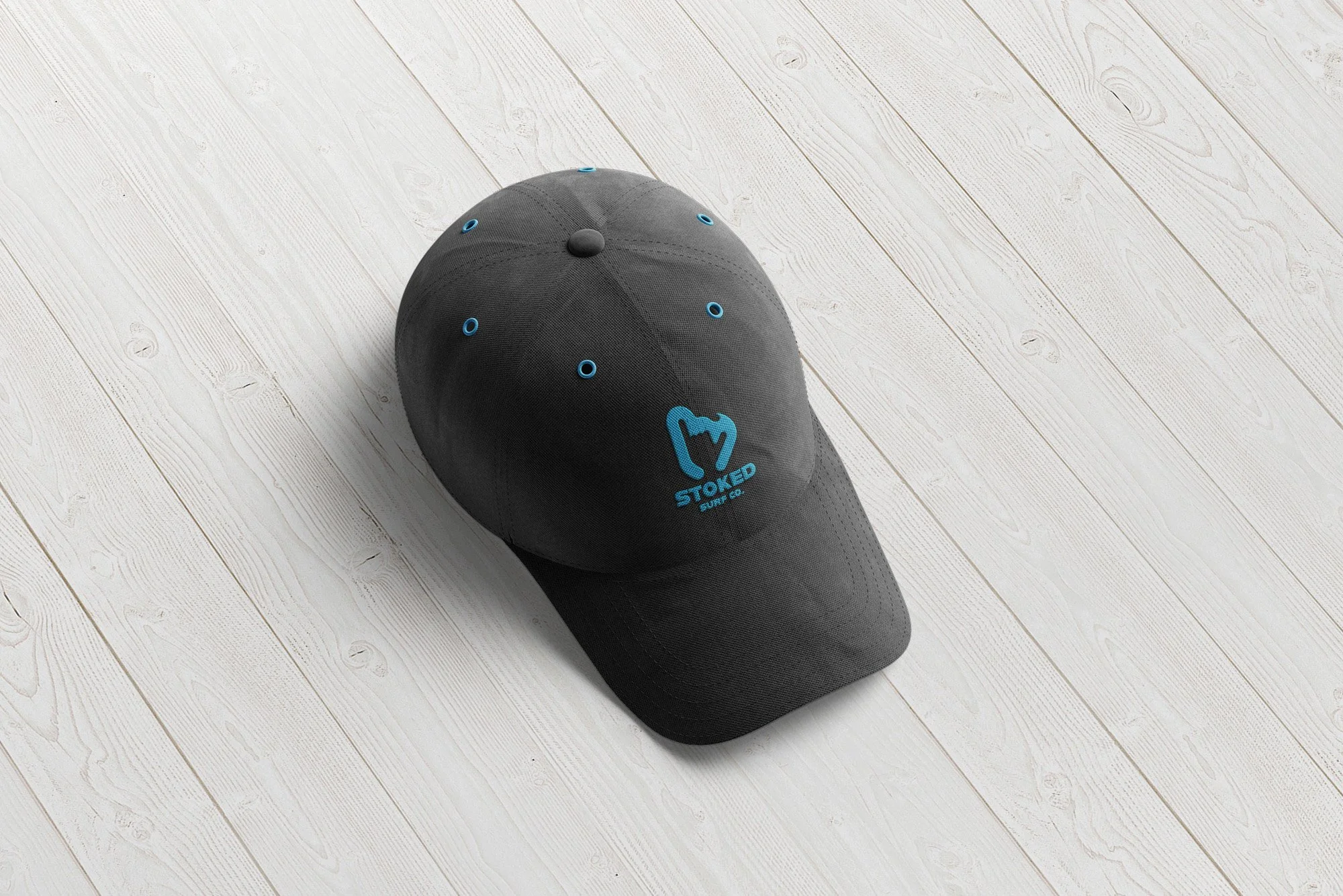
This was a personal project to help reach out to the surfing community. I did a lot of research including watching interviews with the surfing community, and I found that the most common and popular symbol to represent the idea of surf excitement was the “stoked” hand symbol. I also analyzed common symbols and surf terms, and the general direction of the wave shown in the logo correlated with the many terms that surfers used. This wave, combined with the stoked hand symbol, I’m hoping can turn into the universal symbol for surfing one day!


