Client
Southpark Psychology
role
Graphic Designer
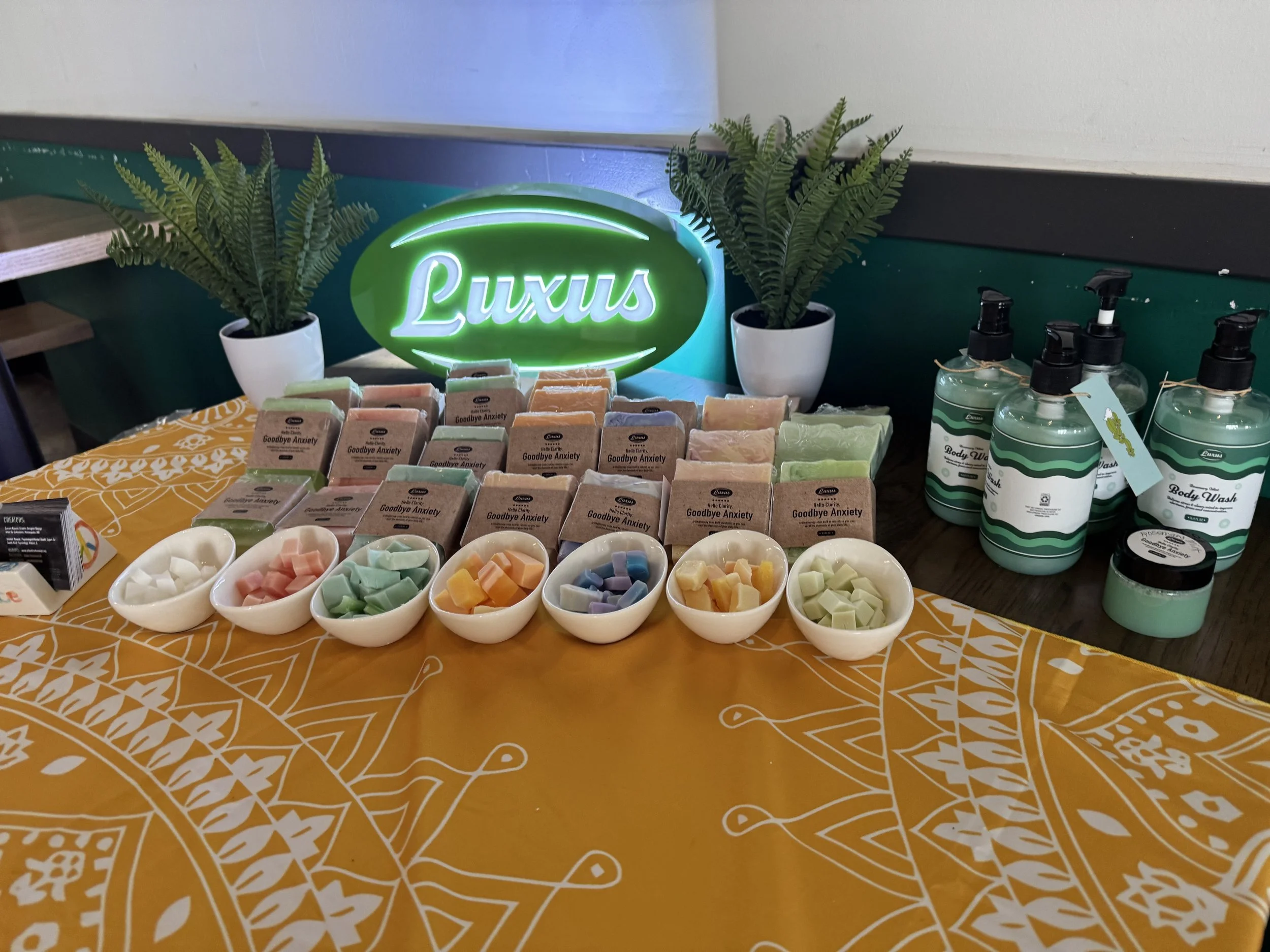
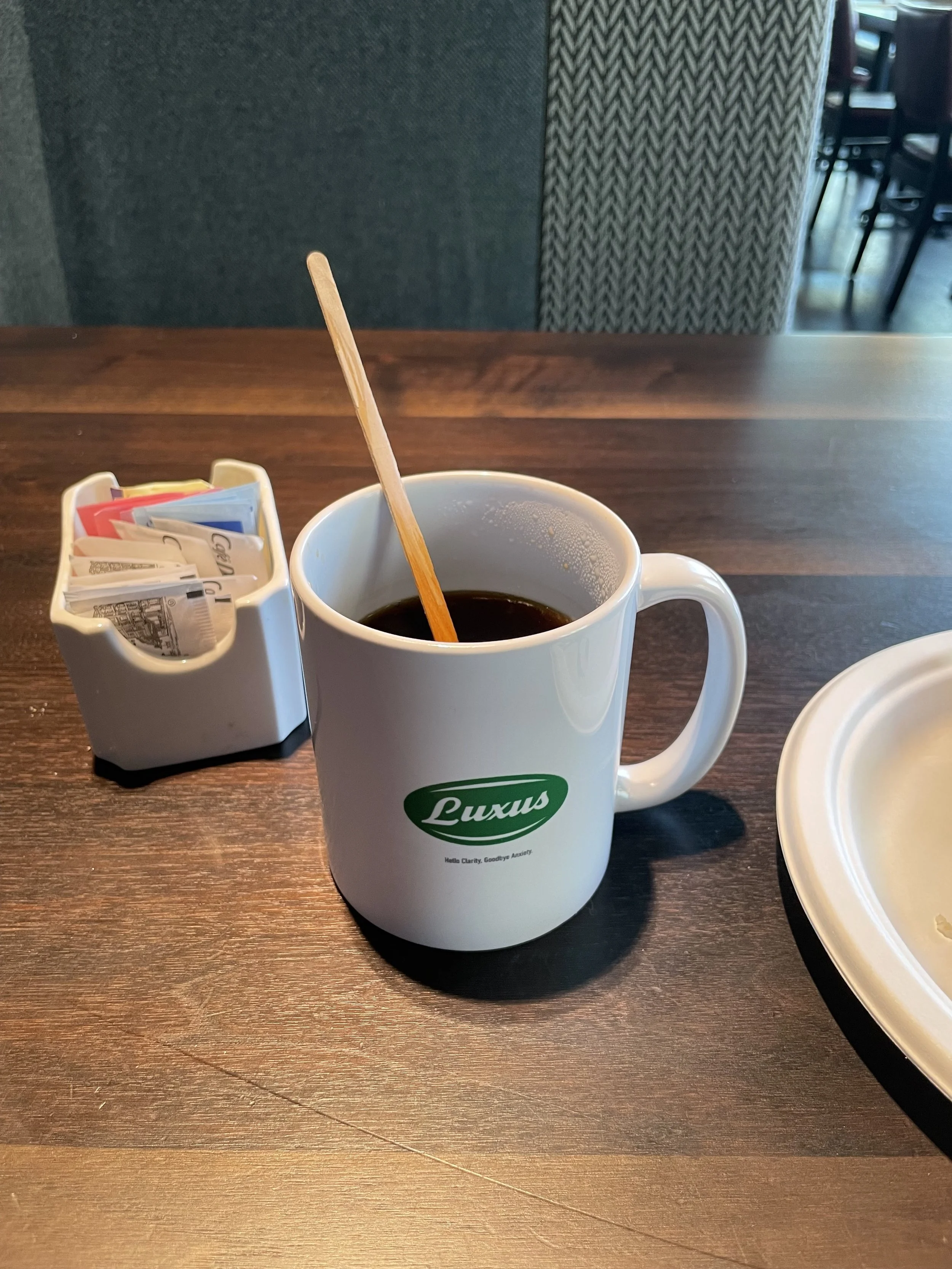
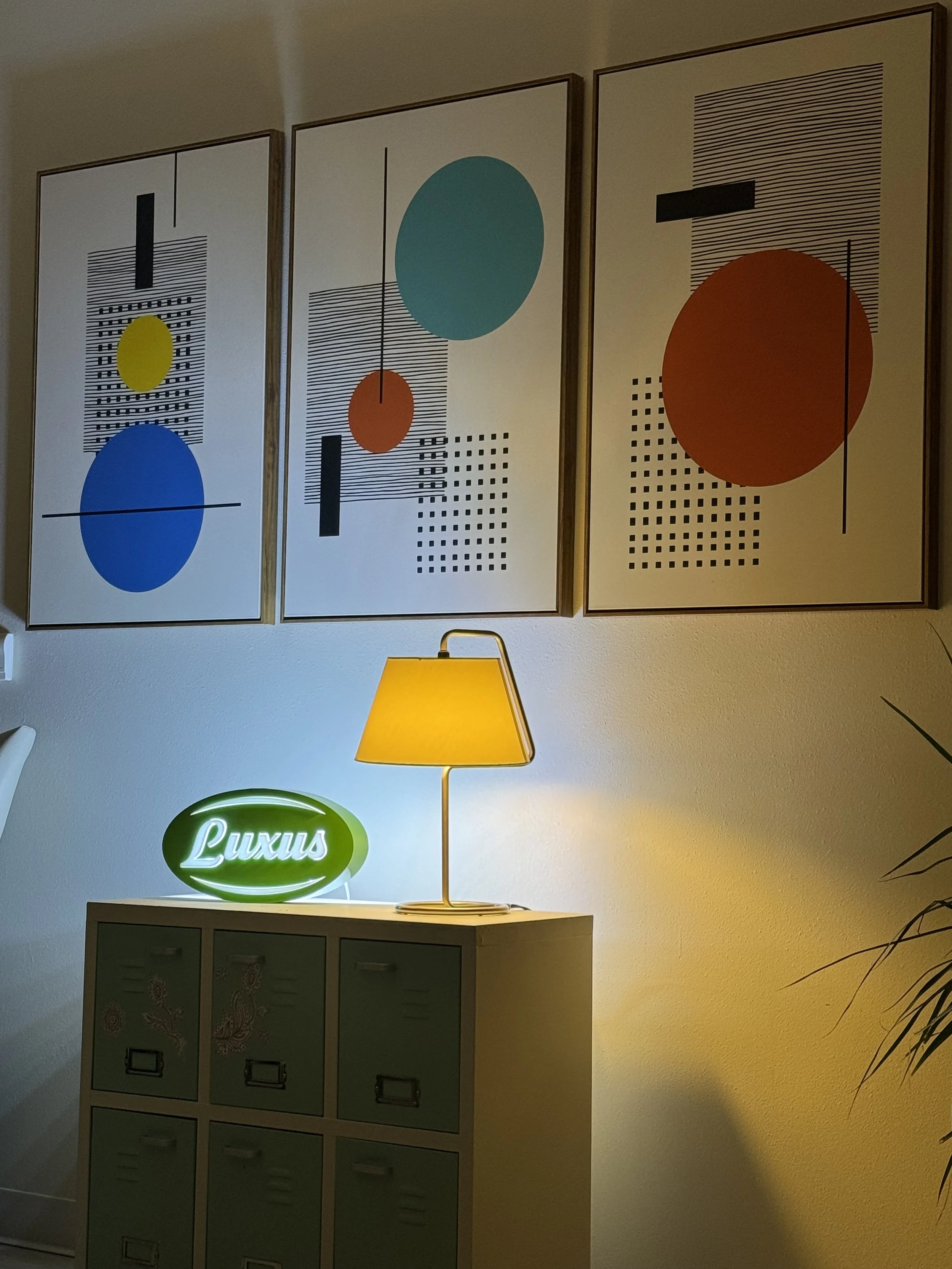
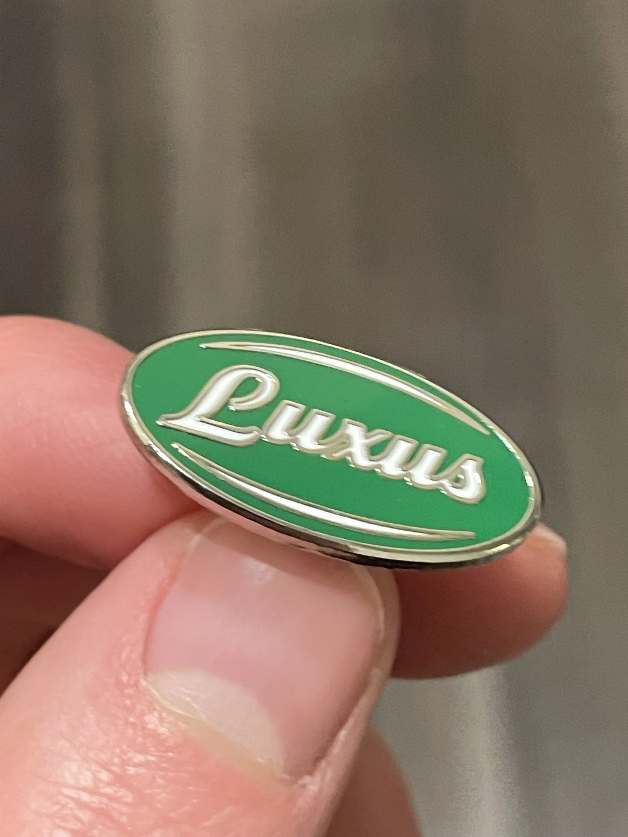
Luxus Brand Identity
This mark is part of a local soap brand in the Quad Cities that is gaining rapid popularity! The concept is an emblem that takes the form of a piece of soap. This is no ordinary crescent logo, but one that is more powerful! The interaction of the L lifting up the rest of the word in Luxus communicates the idea of a soap that is uplifting, which can also be metaphorically represented through bath steam. The steam-looking font lifts the viewer up, which interacts with the idea of a soap that is gender neutral and refreshing. Upon doing research, I noticed that most soap logos tended to use crescents going at an angle, but in order to make ours distinct and communicate the idea of a gender-neutral brand, we kept them horizontal. Because of the gender neutral message with the horizontal layout of the crescents, they combine with the type perfectly to communicate the idea of a brand that is gender neutral and refreshing.