Client
Thrill Aviation
role
Graphic Designer
Thrill Aviation Brand Identity
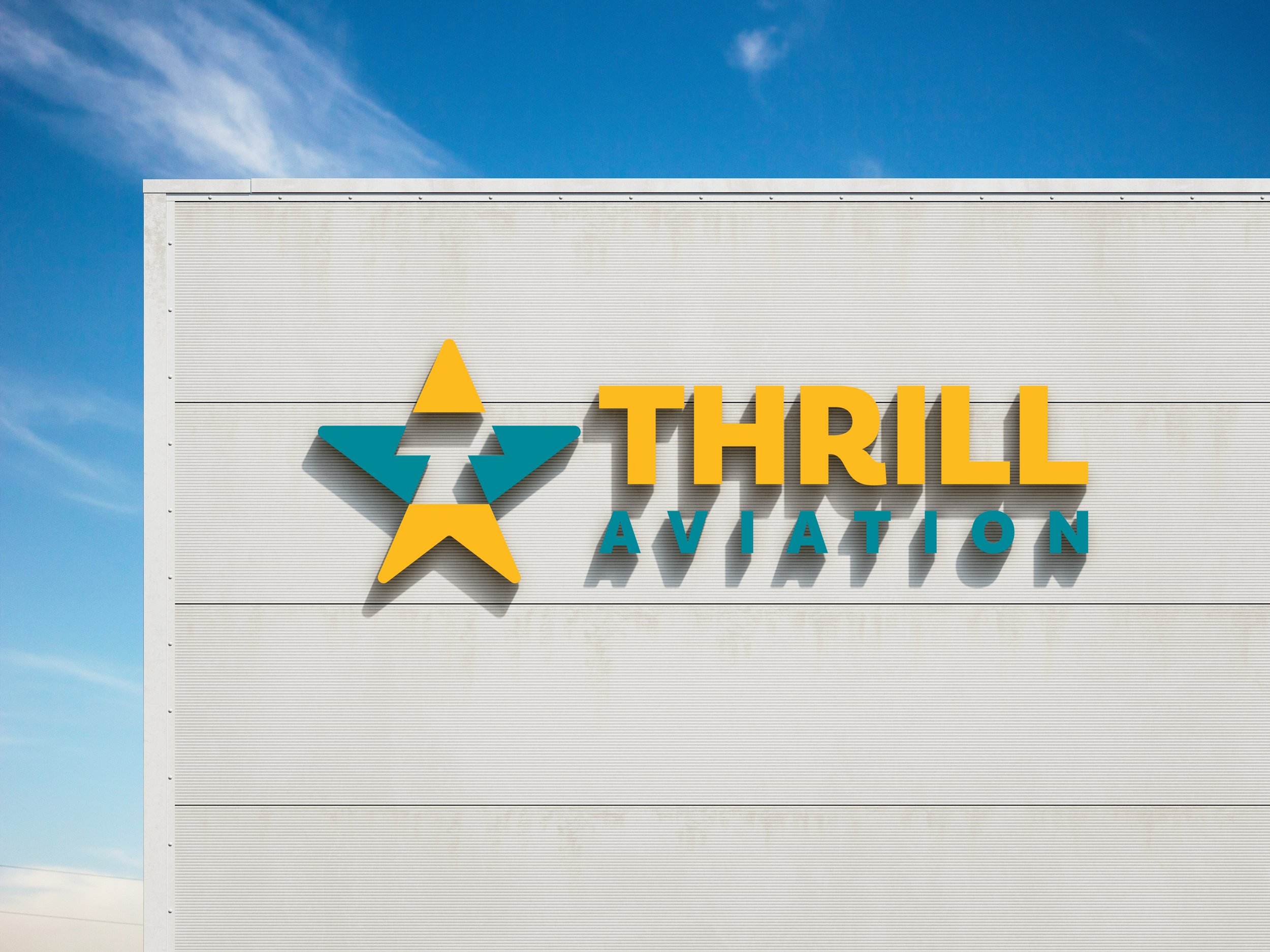
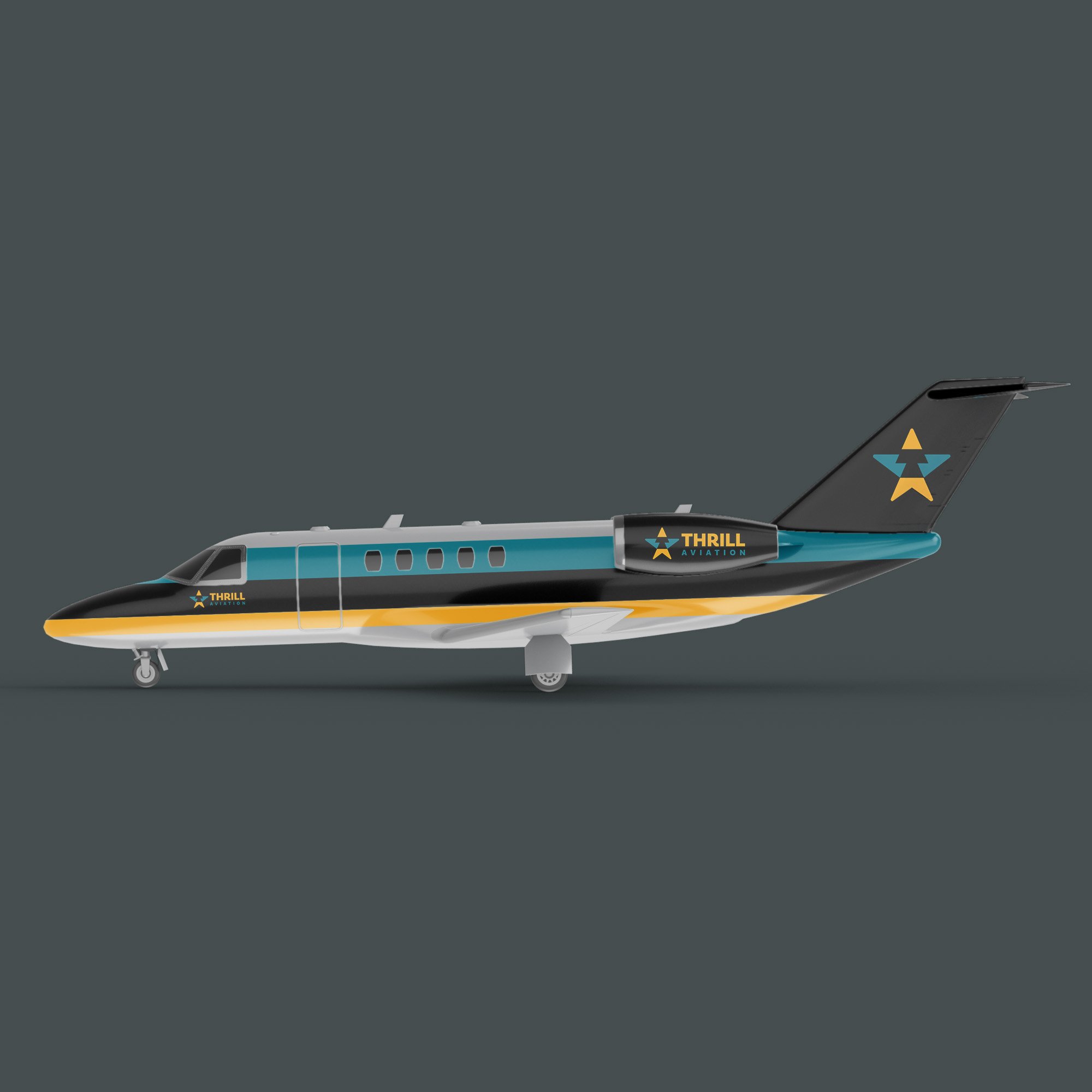
This was a brand identity concept designed for a small private-plane aviation company. The mark is a play on the word thrill and I decided a mix between a T and a star best represented the values being communicated in this identity. 100 sketches and 20 mood boards were built in order to determine the best, most unique solution. After we narrowed down to 10 solutions, we found that a negative-space T that looks like a runway was the best way to represent the thrill a pilot gets when they take off for an adventure!